Anyway, as meticulous as the project manager and I were in going through the wireframes to ensure they looked “clean,” things are always dirtier in the cold light of day (read: during the presentation to the client). Although it went well enough, the hang-ups in this meeting were over the examples used in the wireframes, requiring additional explanations to clarify functionality. Until that moment, I had not given much thought to the kinds of sample data and content I used the in wireframes.
Typically, sample data and content in wireframes is repetitive and invented: 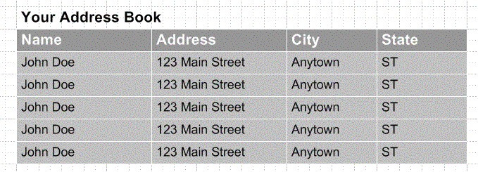
During my presentation, a table similar to this one stopped the client in his tracks. Is it a list of the same address over and over? Given the circumstances—and that the requirements had changed so much—this was not an unreasonable question.
Information architects sometimes do not repeat data but invent more of it, so the address book above might also contain entries for Jane Doe, Homer Simpson, and Mickey Mouse. Invented data or content is essentially meaningless, representing an archetype of the kinds of information expected to appear in different areas.
Using repetitive and/or invented data, however, can confuse and mislead stakeholder in five different ways.
- Misrepresent rules and behavior
- Misrepresent what the user sees
- Shift focus from the design
- Misrepresent the data’s impact on the page layout
- Misrepresent the scope of the fields
To illustrate all these, we’ll look at one of the most data-rich screens available on the Web: the shopping cart.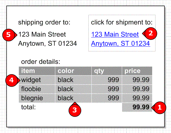
- Misrepresenting rules and behavior:
In a word, the math in our shopping cart doesn’t add up. - Misrepresenting what the user sees:
This order has two destinations and users can click the second destination to see what’s going there. Because the dummy address is repeated, however, it does not accurately illustrate what the user will see. - Shifting focus from design:
If dummy data ends up being inaccurate (“Hey, widgets don’t come in black!”) stakeholders can be more focused on the data than on the architecture. - Misrepresenting data’s impact on page layout:
Using exclusively short examples does not accurately show the designer what he or she will have to accommodate in the page layout. Frequently this leads to some dummy data like, “ThisIsAVeryLongNameToShowWhatLongNamesLookLike.” Which is just weird. - Misrepresenting field scope:
An address field can take so many different forms (apartment numbers, international addresses, ZIP+4, etc) and no dummy data can accurately capture all the variations.
No doubt each of these problems can be solved individually: use numbers that add up, use two different dummy addresses, etc. But coming up with a comprehensive, unified strategy to represent data and content can make wireframes easier to create and present. That is, the examples selected for a wireframe should tell a single, complete story.
The Universe of Sample Data
A cursory review of some wireframes out there reveals five different kinds of sample data and content, listed here from the most concrete to the most abstract:
| Actual | 7220 Wisconsin Ave, Suite 300, Bethesda, MD 20814 |
| Dummy | 123 Main Street, Anytown, ST 22222 |
| Labeled | Address1-30City-30[ZIP-5]
numbers indicate field lengths |
| Symbolic | ##### XXXXXXXXXXXXX XXXXXX, XXXXXXX, XX, #####
for dates: MM/DD/YY or something equivalant |
| Greek | Lorem ipsum dolor sit amet, consectetuer adipiscing elit. Morbi. |
No one kind of sample data is better than any other kind. Indeed, like most things, it depends. In this case, the type of information, the disposition of the client, and the amount of detail required would all influence how examples are displayed.
Some advantages and disadvantages to each kind of sample data:
| Advantages | Disadvantages | |
| Actual | Recognizable by stakeholders. Offers most accurate depiction of what users might see. |
May be difficult to get enough actual data to populate all areas.
May not address all possible variations of data. |
| Dummy | Easy to generate examples. Closely resembles what users might actual see. |
May be confused with actual data. May not address all possible variations of data. |
| Labeled | Describes content of data. | May be difficult to explain to stakeholders. Different data may be represented by same variable names. |
| Symbolic | Can show “shape” of data. | Could clutter wireframe. May be difficult to distinguish between different types of data. |
| Greek | Easy to generate examples. Avoids distraction from interface. |
Represents prose well, but may not represent other kinds of data effectively. |
With the universe of sample data codified, information architects need only a mechanism for deciding which type is best for different applications. A hard-and-fast formula is perhaps not appropriate, but I’ve devised four strategies for typical documentation problems.
Prose
Greek text is most appropriate for representing long blocks of prose. Where description of the content is necessary, I justify and dim the greek while superimposing copy direction over it.

Tables and Lists
Because the data in tables and lists tend to include repetition of type, using dummy data can confuse stakeholders if they take this to mean that the real content (not just the type) is repeated. Using actual data in a table may help, but comes with all the disadvantages of using actual content (finding it, ensuring it represents all variations, etc.) After some experimentation, I decided to use exclusively labeled data:
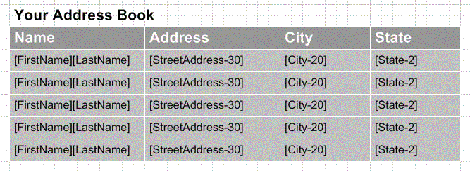
Annotations must accompany such a table to indicate the rules for populating it.
Dates
If a Web application depends on dates, the wireframes should use actual dates and employ them consistently. The project I mentioned at the beginning of this article was a scheduling application. As the wireframes evolved over several weeks, the date examples I used in the wireframes were not applied consistently. Some screens showed sample dates from May and others from August, which made narrating the scenarios very difficult.
To approach this issue on my final round of revisions, I first listed all possible scenarios (schedule new event, change existing event, etc.) and then identified key milestones (first login, first scheduled event, subsequent login, etc.). With these dates defined up front, the wireframes told a more coherent story.
Date data present an additional problem since they can appear in several formats. Wireframes can address this problem by specifying a format on a cover sheet. Symbolic sample data is frequently useful for specifying date content. The symbol should match the format:
| Sample Date | Appropriate Symbol |
| 7/26/04 | M/D/YY (the single M and D specify using one digit where possible) |
| 07/26/2004 | MM/DD/YYYY |
| Jul 26, 2004 | MMM DD, YYYY (the three Ms indicate using the three-letter month abbreviation) |
| July 26, 2004 | MMMM DD, YYYY (the four Ms specify using the full month name) |
| Monday, July 26, 2004 | DDDD, MMMM DD, YYYY (the four Ds BEFORE the month specify spelling out the name of the day) |
Unique and Non-Unique Data
Using labeled sample data presents a challenge because a variable name can represent more than one piece of information. For example, in an address book application, [FirstName] could represent the name of the address book owner or the name of someone in the address book. There are two strategies for dealing with this situation:
- For data that is unique, always use actual or dummy data. In the address book example, the first name of the owner would always be rendered as “Jane,” for example. Non-unique data could then use the labeled format (e.g., [FirstName-20]) without conflicting with unique data.
- Using the labeled data format, visually distinguish unique and non-unique data. For example, when referring to a specific first name, the field could appear with braces instead of brackets: {FirstName-20}.
Conclusion
Sample data can make or break a wireframe, whose purpose is typically to illustrate architecture and interaction. Poorly selected sample data can end up clouding the wireframe or distracting stakeholders from its purpose. By codifying the types of sample content they employ in their deliverables, information architects can create a coherent narrative to illustrate a website’s functionality.
These days, rather than try to think of sample data, I use the labeled format almost exclusively. (Combined with Visio’s stencils, this makes keeping the wireframes up-to-date very easy.) If, later in the process, it becomes appropriate to include more concrete sample data, it’s easy enough for me to go in and change [FirstName-20] to Jane or John.
![]()
Dan Brown has been practicing information architecture and user experience design since 1994. Through his work, he has improved enterprise communications for Fortune 500 clients, including US Airways, Fannie Mae, First USA, British Telecom, Special Olympics, AOL, and the World Bank. Dan has taught classes at Duke, Georgetown, and American Universities and has written articles for the CHI Bulletin, Interactive Television Today (itvt.com) and Boxes and Arrows
“Working with a small set of real data lets you find out about the real state of the data.”
True. But a warning… acquring truly real data may actually violate privacy provisions of a client. And even if it doesn’t, you just never know where some presentations may end up. Is this a big problem? Probably not. Still, the wrong stuff in the wrong place and you could have a crazy large liability problem that started with a totally innocent and well-meaning plan. I’d suggest if you pull real data, you switch about the fields from record to record so nothing represents a real record.
The dummy data comes from the printing and typesetting industry, the language is not Greek but the technique described here is called ‘Greek or ‘Greeking. This is also commonly called ‘dummy text’, ‘lorem ipsum’ or ‘Greek’ or ‘greeked text’, even when text used is infact Latin.
Is greeeking useful in wireframes? Totally depends on the project, your team and the audience for the wireframe.
A stakeholder or a designer may be able to relate to it more when it’s real content, a stakeholder needs to understand the consequences of their decisions. But also for the person creating the wireframes, I find that even when you have done a full content audit and it all appears simple, working with real data while you are working on the wireframes highlights how the layout could work under the strain of real content.
However when you do wireframes that go to the development team greeking is pointless and realistic text is misleading, so best then to either annotate the Greek text or give them the attribute field in brackets (or content tags as mentioned above). How to annotate the wireframes? This then depends on the complexity and scale of the project. The top layer of the presentation of these attributes/content tags can be listed on the wireframe itself and then could reference the content object (metadata) model field which is often another document in itself.
It’s not so important, but “Lorem Ipsum” is actually Latin, not Greek. 🙂 See http://www.lipsum.com .
the issue of real looking data is also true when dealing with technical people as well. I just had an instance where the developer was confused on a mock because I had entered example data using alphanumeric when in fact, the real data is constrained to only numbers.
Great thoughts!
Great list of choices for sample data.
I like to use actual data, data from my client when possible. (Though it’s not hard to find “real” names, addresses, and phone numbers if that’s all you need.) Making this request often reveals who on the team is closest to the real users, which is a good thing to know.
Working with a small set of real data lets you find out about the real state of the data, for example the addresses might be in all upper case, or the name field is combined, or the part numbers won’t really be available until a big data entry project takes place.
Real data leaves less to the imagination. For example, “GP 3000 700X23C RED/BLK” is obviously a popular road bike tire manufactured by Continental to anyone in the bike industry, but I bet some UI designers or developers would say it’s a “confusing” description of a tire, since it doesn’t even use the word tire. By leaving it as a label, “[Description]”, people will fill in the blanks with their own assumptions, postponing decisions about how actual data will eventually appear. This may or may not be a good thing: sometimes you don’t want to get hung up on examples, but sometimes, that’s the best way to spark the right discussion.
it’s not Greek.. it’s Latin text..
What a great idea to write about this. Ideally, I try to go beyond fake-data-that-does-not-confuse-people. When the data in the wireframe supports a common scenario, it helps everyone (including me) evaluate the design. It requires a real cognitive walk-through to get the data right, but it’s worth he time spent with a calculator and Google. It gives the stakeholders confidence, and I’m sure I get more support in the project as a result.
A tip: Use Google Sets when you can only think of a few examples of something.
(btw, my favorite long name for wireframes is Jonathan Balasubramanian.)
This was a great article. I have found that the client drives which way I go. More mature client relationships allow me to get away with less time consuming approaches because I have been coaching them with previous deliverables (they love when you save them money). No matter what I do, however, I frame their expectations about what they are going to get before I get going. They can typically tell you if that’s going to work for them or not. Thanks Dan!
This is great to see. I’ve also been using a similar technique (including the square brackets etc). I call them ‘ContentTags’. But I find it these are only useful for in-house design and development(developers love them!).
But when it comes to usability testing on a paper prototype (or selling the designs to non-technical clients) they find the placeholders a distraction – they don’t get a view of the application in a real world context.
To get around this I convert the ‘ContentTags’ into human-readable content (dummy data). This way the users are not distracted by tech-speak -improving the accuracy of the usability test.
So in my experience your technique is right-on, but the use of dummy data is still valuable in certain situations.
I’m turning these initial ideas into a poster for the IA Summit. If you have further suggestions or things you’d like to see, please let me know! I’m brownorama by way of gmail.com.
See you in Montreal!