Web design is expensive. Web designers earn upwards of $50,000 a year1, information architects earn even more.2 During the heyday of web design—the late 1990s—designing a large commercial website could cost as much as designing a medium-sized building. During this period, commercial websites were created and then often completely replaced with redesigned versions a short time later. Today the redesigning continues, albeit at a slower pace. What is the return on this design investment? A report on online ROI from Forrester finds that many commercial sites fail to even try to measure the effectiveness of design changes.3
| What lessons have we learned about how design improves the interface between customers and companies? |
The web has been with us for about a decade now. We’ve seen some obvious trends, such as greater use of multimedia, search engines, and increasingly sophisticated markup techniques. But these trends were facilitated by changes in technology. What lessons have we learned about how design improves the interface between customers and companies? Perhaps we can start by asking how websites have actually changed over time, and from that we can learn how websites should change in the future.
To start working toward an answer, I compared three eCommerce sites: Borders.com, BarnesandNoble.com, and Amazon.com. Much of the media’s coverage of these websites, especially coverage of Amazon.com, discusses the business models, corporate cultures, and finances of the companies. Since the medium of interaction with these companies is the website, it’s ironic that the media rarely critiques the site design and its effect on business performance.
Because it is the homepage that carries the most responsibility for guiding customers, I examined the homepages of all three sites from a number of years, using screenshots from the Web Archive4. Presumably these large retailers had a great deal to gain, and lose, with these substantial online ventures. By comparing design decisions over time among the three sites, I hoped to discover lessons from their extensive and expensive design experience.
![]()
The companies
Competition is fierce in the online bookselling market, currently erupting in offers of “free shipping.” All three companies have annual revenues in the billions of dollars.
Barnes and Noble, which runs a large chain of stores in the United States, claims the largest audience reach of any bricks-and-mortar company with Internet presence.5 Yet, both they and Borders were put on the defensive when Amazon’s growth rocketed. During December, 2001 BarnesandNoble.com attracted over 10 million unique visitors,6 compared to Amazon’s 40 million visitors.7
Borders is the second largest bricks-and-mortar book chain in the U.S. 8 In April 2001, after operating their own online bookstore for several years, Borders announced an agreement to use Amazon’s eCommerce platform to power a co-branded website.
Amazon claims to be the leading online shopping site, having expanded their selection to music, video, auctions, electronics, housewares, computers and more.9 By February of 2002, Amazon, which had pursued a get-big-quick strategy typical of internet companies in the late 1990s, announced its first profitable quarter.10
Criteria
I first studied these sites quantitatively looking for clear trends over time. I then critiqued them in a more qualitative way based on my own experience as both an in-house website designer and as an information architecture consultant.
There are many criteria that could be examined in such a study. I limited myself to those that would, I hoped, reveal as much as possible about the business intent of the design. I looked at criteria such as the type and size of layout, the type and amount of navigation, the amount of images and text, and functionality specific to the industry. Detailed results can be seen in the attached spreadsheet (PDF, 75k).
Analysis
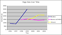 Click to enlarge. Note: Missing data due to imperfect records at the Web Archive. |
All three sites use very long screens to display content on their homepages.
Using a browser window with a constant width, we can compare the vertical size of each site (all screen references assume an 800 by 600 pixel monitor). The Borders.com homepage grew from a vertical size of about 917 pixels in 1996 to over 3,000 pixels in 1999. Barnes and Noble’s homepage has hovered around 1,500 pixels for the last several years. Amazon’s homepage, which began at only 626 vertical pixels in 1995, stands at roughly 2,156 pixels today. In a web browser, that equals five scrolling screens of information.
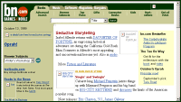
 Borders.com above the fold (1999) Click to enlarge. |
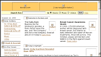
 Barnes and Noble above the fold (1999) Click to enlarge. |
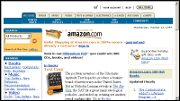 Amazon above the fold (1999) Click to enlarge. Note: Incomplete web pages are due to imperfect records at the Web Archive. |
All three sites evolved to use three-column layouts.
In 1995 and 1996 respectively, Amazon and Borders.com used single-column layouts. By 1999, both of these sites as well as Barnes and Noble used three column layouts.
Amazon has consistently placed more links above the fold.
In 1999, the Borders site displayed only about eight links “above the fold” (the top portion of the screen that is viewable without scrolling). Both Barnes and Noble and Amazon had significantly more links above the fold in 1999, 30 and 48 respectively. Amazon averaged 43 links above the fold between 1999 and 2002 versus only 27 links for Barnes and Noble during the same period.
Through the years, the density of links on Borders.com was half of that on Barnes and Noble or Amazon.
The density of links has varied over time, but as of 2002 both Barnes and Noble and Amazon stood at about one link for every 15 vertical pixels of screen real estate. Historically, the highest link density at Borders.com was one link for every 28 vertical pixels.
Amazon communicates using images and links rather than text descriptions.
From 1999 through 2001, Amazon used more images and fewer text descriptions than Barnes and Noble. In 2002, both sites used about 560 words per page, yet the density of words was 33 percent lower on Amazon; Amazon distributes the words across the page as links rather than bunching them together in paragraphs. Over time, Barnes and Noble is becoming more like Amazon in this respect.
All sites eventually included navigation targeted at specific audiences.
Audience-based navigation—navigation labeled for a particular audience—appeared on Borders.com in 1998, on Barnes and Noble in 2000, and on Amazon as early as 1999.
Invitations to subscribe to an email newsletter were offered inconsistently.
Borders.com didn’t include this feature until 1998. Barnes and Noble included it only in 1998 and 2001. Only Amazon consistently included this feature from 1995 to 2002.
Online and offline design
So what lessons can we learn about how these sites changed over time? How has design contributed to Amazon’s high growth and significant lead over the others? In general, Amazon found a winning formula and applied it consistently over time. In my mind, the successful design elements emulated offline shopping experiences in many ways.
Personally, I was surprised at how long these homepages had grown. Combined with the three-column layout, each page contains a great deal of information. This is quite like the perceptual experience of browsing in a physical store. When you walk down an aisle in a bricks-and-mortar store you can visually scan the shelves quite quickly. On these websites, the long, scrolling pages are analogous to aisles (major groupings of items) and the columns are analogous to shelves (more specific groupings of items). With a similarly natural, efficient motion, a visitor can scroll down the page and visually scan the three columns of product listings.
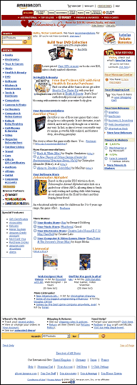 Amazon homepage (January, 2002) Click to enlarge. |
 Barnes and Noble homepage (January, 2002) Click to enlarge. |
Amazon’s higher number and density of links, and placement of those links above the fold, also reminds me of the aggressive product positioning in a physical store. It’s like walking into a food market and immediately being overwhelmed with rows and rows of colorful fresh fruit, stimulating our eyes and engaging our appetites.
The prominent use of images and sparse use of text on Amazon again harks back to physical objects with simple labeling.
The arrival of navigation intended for specific audiences seemed inevitable. Especially for the book market, a children’s section was developed surprisingly late on these sites given the disproportionately high revenues that come from children’s books in traditional shopping venues.
In general, many of the functions of these pages have become commodities: search engines, shopping carts, authentication and store locators. But Amazon’s extensive personalization sets this site apart functionally. Personalization mimics a personal shopper or a local store employee who knows you. While the online recommendations aren’t always right on, neither is a human assistant.
Rate of change
Many studies have found that our performance using a software application improves over time as we become familiar with its interface. Gerald Lohse and his associates translated this finding into the realm of eCommerce websites using statistical analysis.11 They also found that website visitors learn to use a site more efficiently over time and that this increases their purchase rate. In simpler terms, it means familiar sites are easier for people to use, so familiar sites are where visitors will make purchases.
It follows that sites that can be learned more quickly will more quickly become familiar, increasing the amount of purchases. So a faster learning rate equals a higher purchase rate.
Furthermore, Lohse found that familiarity with a particular website makes visitors less likely to switch to a competitive site because of the effort and time needed to become familiar with another site. He refers to this behavior as “cognitive lock-in.” Essentially, we are creatures of habit. He applied this analysis to several eCommerce websites by measuring the number of visits per person, length of sessions, and timing and frequency of purchases. He found the learning rate significantly faster at Amazon than at Barnes and Noble.
The rate of design change supports this finding. Amazon had no major redesigns from 1999 to 2002, only adapting their design gradually to changing needs. Barnes and Noble significantly altered their navigation in 2000 and 2001. Borders.com implemented major homepage changes in 1998 and 2000. Fewer redesigns make it easier for visitors to remain familiar with the site.
Conclusion
Many design elements on these websites are reminiscent of physical store layout, an approach to web design we should investigate further. Like physical stores, those designs should only change gradually to keep visitors buying. Continued analysis of other sites will hopefully help confirm or deny these findings.
It may be a fallacy to state, “Amazon is a successful business, therefore their website design is successful,” since many factors have contributed to their business success. And yet it’s hard to imagine them having such great success with a mediocre site. A similar eCommerce site launching today could do worse than examine and emulate the design elements that Amazon utilizes.
| View all End Notes |
| Victor Lombardi writes, designs, and counsels, usually in New York City. His personal website is http://www.noisebetweenstations.com. |
While this was a fascinating article, I don’t quite see the point. The analysis didn’t tell me if any of the three bookstore redesigns resulted in an increased return on investment, increased sales, increased click-through, fewer abandoned shopping carts – all things I would want to know when critiquing the design of an ecommerce site.
Is a design “resembling a physical store layout” really the most effective? Is this even true (that the design resembles a physical store layout, I mean)? Frankly, I don’t see it.
This conclusion: “Like physical stores, those designs should only change gradually to keep visitors buying.” may or may not be true, but it’s not based on this analysis. Also, most physical stores do not retain the same layout consistently – something that seems to drive customers crazy (especially in a grocery store).
Counting pixels and calculating link density doesn’t answer any questions about the impact of a design on sales (assuming a basic usable design to begin with). You HAVE to look at financial measures and usage statistics. For all we know, even though Amazon might generate more sales, Barnes and Noble might have a more profitable design. When the more profitable design is determined, THEN the pixel counting/link density calculation should come into play.
I was actually a little bit disappointed by the results. It seems like Victor did some great leg work in tracking the changes, however I was hoping for some solid conclusions to discuss. Perhaps someone will be willing to put a stake in the ground and state what is “good” and what is “bad” in this oh-so popular genre of commerce sites?
That being said I did appreciated Victor’s analogy of physical store design (although I can hardly say it is anything new to think about.) In any case I found it interesting that he compared the above-the-fold home page design to experience of walking into the store. I learned in marketing class that studies have shown that the first 10 feet while walking into a store are essentially dead space, because people are primarily concerned with getting into the store first. They eventually start to look around, but only after those first 10 feet or so.
If that is true and the analogy between virtual and physical stores hold true, then it would 1) explain the extensive content below-the-fold and 2) demand that the secondary and tertiary pages be analyzed in conjunction with the home page. Both of those options are places for users to “walk” to once they are “in” the store.
Do you as a _____ designer/architect consider and/or agree with “the first 10 feet are for getting into the store” theory?
In response to Lee…while I’d love to actually measure the ROI of these sites, it’d be difficult to get the requisite cost information out of these companies given the highly competitive state of the industry.
Given this environment, I took a different approach: we know something about their return (they have very high figures for revenue and unique visitors), so what characteristics of their design could be contributing (or at least not detracting) from that return?
Essentially Amazon has a very successful site, and I wanted to try and quantify what was different about their design. Before doing this analysis I didn’t really know. Now I have some definite indications.
The analogy to a physical store layout was my subjective analysis. After comparing all this data for weeks it was an intuitive conclusion. Again, it’s not fact, it’s an idea I think is interesting and worth more investigation on a perceptual/cognitive level.
The article is not bulletproof, we could comment to infinity on its shortcomings. If you find something you find interesting and that makes you think a little differently next time you lay out a page for an e-commerce site, I consider it a success.
Thanks for reading 🙂
Hey folks: Please, please please go to the feedback form in the about section to dispense advice on how to improve B&A.. we’ve already implemented a LOT of your comments and the site is changing hourly. ( http://www.boxesandarrows.com/about/contactus.php )
Please keep the comments to comment on the author’s words. Thanks you, and thanks for making B&A better!
Victor, Mark Hurst of Creative Good does (or maybe did – I haven’t heard anything from his group in quite some time now) usability/site design/metrics research. It would be interesting to apply your analysis to the sites Creative Good determines are best-practice ecommerce sites. For example, the calculation on above-the-fold link density on sites with a such-and-such ROI increase after redesign, etc. (I wish I had some time to spare – I’d start looking through 10Ks to see if I could isolate some of the numbers needed for a full analysis of site redesigns.) And it would be interesting to do this with different types of products.
Also, we know very little about Amazon’s returns based on revenue and traffic numbers because we don’t know how much that traffic costs, or how much the conversion from visitor to customer costs. Don’t forget, until the last quarter, Amazon’s costs were a lot higher than its revenue.
Based on your spreadsheet, the only apparently significant differences between Amazon & BN are that Amazon has 60% more links and, since there are more links, there are more of them above the fold. Based on your spreadsheet, the only conclusion I could begin to draw is “if you want to sell more stuff, put more links on the home page.” And I would reserve judgment on that until I saw the statistics and accounted for things like maybe buyers of pots and pans or electric screwdrivers like links, but book buyers hate links.
You sure did open up an interesting line of thought with this article! That’s why I said it was fascinating. I think it is a good starting point to maybe come up with an ideal set of metrics on ecommerce site design – one that marries the economics with the actual nuts and bolts (ie. based on these metrics, if you want to achieve this, then do that … )
Dear Victor,
Thank you for a most informative article about the differences in web-site design among three top-tier competitors. I was impressed with your simple, elegant approach the the question, “What makes a web site successful?” If I’m off the mark on your hypothesis, forgive me.
The piece points out several key issues that are important to all selling, offline and online: 1) Good, easy to understand and comprehend images and short links are better than text. Show, don’t tell! 2) Have minimal text on the page; 3) Put most important items, links, etc. above the fold, i.e. the topmost space on a web site that is most likely to fit on the average browser window, on a typical computer; 4) The simpler it is for a viewer to learn the site, the more apt they are to buy from it and return to it; 5) Use several columns for lots of info on a page, which is analogous to aisles in a store, rather than having the page extend below the fold.
How much more information does one need to implement their own avenue of approach to this hypothesis? I think you could’ve written the article in one paragraph, placing the research results as footnotes and simply writing the summary in bullets.
If people do not entiende the importance of this piece, then they weren’t very good bullet-catchers. Our design team is continually praised for simple, elegant web sites that use high-end graphics and images. We also hear from clients and visitors who thank us profusely for applying the age-old maxim: Keep It Simple!
Picante!
Will Garner
Head Bullet Catcher
RE>How much more information does one need to implement their own avenue of approach to this hypothesis?
That depends on your level of confidence in this analysis. I’m confident enough that it will influence my design, but next I want to further test these issues using other techniques, usability testing for example.
RE>I think you could’ve written the article in one paragraph, placing the research results as footnotes and simply writing the summary in bullets.
I’d love to see your version of the Gettysburg Address 😉 Usability and experience ain’t the same thing.
[Disclosure: I was part of the team that developed Borders’ online presence.]
One interesting and relevant tidbit is that Borders’ primary objective for its web presence was to maintain its brand and identity not necessarily to sell more product online. Borders was interested in using the Web and Internet technology to maintain effective bricks-and-mortar operations and strong relationships with an already large and dedicated customer base with the expectation that they’d continue to choose Borders for its unique brand and keep visiting Borders stores. (Whether this is valid or even worked is another story…) Borders never intended to compete for online traffic or sales; in fact, many financial analyses pointed to disaster no matter what the online sales volume was because the margins were so low (or even sub-zero). If anything, Borders had improved ROI through their retail convergence strategy, which used the same Internet-enabled systems to improve retail operations technology infrastructure and enable the heavily-used in store kiosks, clerk stations, and inventory systems.
Since the Borders brand is quite wordy, enriching, quirky — always offering a particular point of view — and relatively “sophisticated,” the site design intentionally tried to offer an enriching and personable experience. It may or may not be true that this approach doesn’t lead to more sales, but more sales wasn’t the goal. The Borders store retail experiences are quite differentiated as well. Borders stores are typically enriched environments that encourage customers to sit down in a cozy chair or at the cafe or at a music kiosk and spend some quality time sampling the merchandise.
So how does all this bear on Victor’s analysis? For starters, I think it’s difficult to compare any form or measure of ROI separate from the bigger picture of what a firm has to gain or lose from an online presence. It’s impossible to compare sites without first establising that they have common measures of success. Second, I’m disturbed by the lack of any mention of audience/user needs and expectations in the evaluation. It’s pretty clear that Borders was going after a different audience and thus designed differently. Third, the prominent role brand plays in both e-tail and retail should be addressed as a fundamental way sellers differentiate themselves, create a following, enable a virtual or phyical experience, and ultimately create sales…
This is a great topic and Victor has done a great job getting us to think hard about the main questions. I’m looking forward to seeing the next piece.
“Given this environment, I took a different approach: we know something about their return (they have very high figures for revenue and unique visitors), so what characteristics of their design could be contributing (or at least not detracting) from that return?”
There was a similar statement in the article, and it essentially begs the question. The initial proposition should be, Does site design increase revenue for Amazon?
Amazon was among the first big names in on-line shopping. I suspect people became accustomed to Amazon’s layout, and over time it became a de facto standard. Other sites copied it, not because it was the best per se, but because they knew visitors would find it familiar.