Introduction
User interface (UI) patterns have the potential to make software development more efficient. The prospect of such efficiency gains has led to interest in user interface (UI) patterns by individuals and organizations looking for ways to increase quality while at the same time reducing the costs associated with software development.
The very nature of UI patterns requires that they be familiar to end-users. An individual UI pattern is a discrete, repeatable unit of user experience. I refer to collection of patterns as a library.
In many cases, less proprietary patterns are more useful in solving a design problem as they can be implemented more uniformly across platforms. This characteristic and the efficiency gains make patterns an excellent opportunity for software companies to come together and promote UI patterns to the wider development community.
Producing a common pattern library, however, implies that the patterns presented are at the very least, consistently documented and most probably presented in the same single classification system. Currently though, patterns are classified and documented in various manners across publishers with no clear standard evident.
The problem
To date, the most common approach to propagating a single user experience standard is the development of UI guidelines and principles documentation within an organization. Development teams — usually incorporating a user experience specialist — then reference this documentation during implementation and upgrade processes.
However, as the numbers of systems grow within an organization, so does the effort needed to maintain the quality and consistency of the user experience. For many organizations, it is now impossible to assign much, if any, time of a user experience specialist to all implementation efforts, and experience has shown that the UI guidelines and principles approach to propagating a single user experience standard does not scale well.
There are two common issues, both major.
The first issue is ensuring developers are familiar with all the principles and guidelines.
Documentation to fully describe a UI standard is, by its nature, extremely detailed and complex. Getting developers to know all this information intimately is an ongoing and often un-winnable battle.
The second major issue is that the application of guidelines and principles can be open to wide interpretation.
Requiring developers to combine guidelines and apply principles together to create a complete UI can be inefficient. This synthesis process can result in widely-varying solutions to a single design problem across teams — especially when working with widely distributed and possibly culturally diverse groups. Removing these variances to create a more consistent user experience requires rework.
The solution
UI patterns to a great extent mitigate the problems of weight and interpretation experienced with the principles and guidelines documentation approach of the past. In essence, patterns can be seen as prepackaged solutions based on guidelines and principles.
Patterns and pattern libraries are more convenient for developers because they solve common higher-level design problems without the need for deep knowledge of often-complex guidelines and principles documentation. Also, they implement best practices, so developers don’t synthesize what are often “slightly original” solutions that would need to be reworked later.
Much of the value of a pattern to the developer is its less granular and more physical nature. Principles of good UI design dressed up as UI patterns add little value over traditional guidelines and principles documentation, as seen in many of the UI patterns as described in the Design of Sites; examples such as “Low Number of Files” — while an important design principle or guideline — do not deliver up a usable UI component.
Also important is creating the patterns to begin with. The guidelines and principles that form the foundation of patterns still need to be developed before any patterns themselves are developed.
Integrating UI patterns
Integrating UI patterns into the culture of software development is to a large extent still beginning. Next-generation development tools such as those proprietary ones being developed by enterprise software companies that implement patterns natively are now or will be soon in the hands of developers around the world.
Embedded drag and drop UI patterns hold the promise to empower developers to create better user interfaces, faster — unsupervised by user experience specialists. While this may strike fear in the hearts of many a user experience specialist, issues of scale dictate such a pragmatic approach. Be aware though, that they also can perpetuate problems if the UI patterns implemented are out of sync with end-user expectations.
Why standardize UI patterns?
Currently, there is no recognized standard for the classification or documentation of UI patterns, as seen by browsing through pattern libraries from:
- Martin Welie’s UI patterns
- Jennifer Tidwell’s UI Design Patterns
- Sari Laakso User Interface Design Patterns
- The Design of Sites: Patterns, Principles and Processes for Crafting a Customer-Centered Web Experience by van Duyne, Landay and Hong.
- Yahoo Design Pattern Library
The variety isn’t surprising, since applying the pattern concept to user experience design is a relatively recent phenomenon. However, the successful introduction of a single classification and documentation standard could significantly increase the value of a UI pattern library to developers by…
- Reducing confusion among pattern versions across collections. Not surprisingly, many of the same patterns exist across collections. A standard classification system (discussed below) can help developers make sense of both these patterns and their different versions in collections across the web and in paper publications.
- Promoting development of net new UI patterns. A clear classification taxonomy is likely to make the “holes” in the current crop of pattern libraries more apparent, which in turn hopefully will increase the pace of development of new UI patterns.
- Providing a standard UI pattern interface. As the number of patterns increases, pattern search tools will become more important. A standard classification and documentation approach will enable developers to quickly display their UI options.
- Promoting UI pattern adoption. A clear classification taxonomy is likely to have the effect of making patterns easier to find and in turn increase their use.
Problems with the solution: UI pattern Classification Approaches
The following is a high-level analysis and discussion on classification approaches of the previously mentioned UI pattern collections. Each collection is mapped and discussed from a classification and documentation perspective.
Martin Welie’s patterns
Classification Analysis
Patterns in Interaction Design
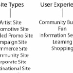
Figure 1. Classification Map (click image to enlarge)
Welie divides the patterns into three delivery methods: Web design patterns, GUI design patterns, and mobile design patterns. Within the web design patterns channel (the focus of this document), the patterns are categorized into ten groups based on a mix of content and functional subjects.
Documentation Approach
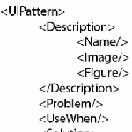
Figure 2. Documentation Map (click image to enlarge)
Welie’s documentation approach is simple, with a focus on visual elements to explain the function of the pattern. It can be broken into three main parts:
- Description: This area of the documentation provides the name and image to describe the pattern.
- Rationale: This area provides a description of the problem that is solved by the pattern, how it works, and the scope of its use.
- Associations: This area provides links to other patterns related to the current pattern.
Jennifer Tidwell’s patterns
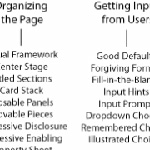
The following is a map of Jennifer Tidwell’s UI Design Patterns. (Click image to enlarge.)
Unlike Welie, Tidwell does not take into account different delivery methods. The eight categories she does specify look to be based on functional subject areas only.
Sari Laakso’s patterns
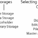
The following is a map of Sari Laakso’s UI patterns. (Click image to enlarge.)
Like Tidwell, Laakso does not differentiate between delivery methods; he bases all seven of his categories on functional subject areas.
The Design of Sites’ patterns
The following is a map the patterns presented in “The Design of Sites.” (Click image to enlarge.)
The most extensive pattern collection of the four sampled, Design of Sites does not specify delivery methods, and, in some cases, the items presented could be regarded as design guidelines or principals rather than patterns. Twelve categories are presented with a mix of content and functional subjects.
Summarizing the classification types
From this analysis three main types of classification are present — content subject, functional subject, and delivery platform.
Content subject classifications normally specify an application genre (for example, ecommerce and supply chain management). Examples of content subject based classifications can be found in the Design of Sites collection under “Site Genres” and in Welie’s collection under “Site Types.”
Functional subject classifications are based on logical breakup of functionality (for example, shopping cart and two-panel selector). This is the most common prevalent classification type and is found in all the collections sampled.
Delivery method is used to describe the platform on which a pattern has been designed to operate. This classification type opens up the possibility for unique patterns to be developed for the same subject classifications across platforms. This classification type has the potential to provide more resolution for developers looking to offtake a pattern within a specific UI delivery platform such as mobile, desktop, or web.
Based on the publicly available pattern libraries available today, there is no clear indication as to whether “delivery method” is a valid classification type. An argument could be made that the process of binding a pattern to a specific technology is will reduce the life of the pattern as platforms develop. However, the timelessness of a pattern is of little consequence to developers whose primary goal is product delivery rather than pattern lifecycle.
Another Classification type – Level
This author would like to include an additional classification type: Level.
The level classification would further divide patterns into the following areas of concern:
- Navigation architecture: Patterns relating to the navigation of content within an application
- Screen architecture: Patterns which position functionality and content within a screen
- Site furniture: Patterns for formatting functionality and content
In the case of the collections previously reviewed, the great majority of patterns would be classified as falling under the “site furniture” level type. However, it is this author’s view that considerable potential remains to develop patterns within the proposed navigation architecture and screen architecture level types.
A proposed classification system
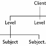
The above diagram (click image to enlarge) describes a potential pattern library classification hierarchy. In this case, client classification nodes are presented at the top of the tree similar to that of the Welie collection; the proposed new level classification nodes are added above subject.
Content and functional subjects would be implemented as tags because these classifications would occur across levels.
Why have a classification hierarchy — aren’t filters or tags more useful?
In many cases, being able to filter by classification node as required is more flexible than drilling down through a preset hierarchy. However, a present classification tree is also useful to:
- Automate the generation URLs to enable cross linkages within the UI pattern library.
- Provide a simple drill experience for end users who have no specific problem to solve but rather just wish to browse to learn and or generate ideas.
UI pattern Documentation Proposal
The value of a standardized UI pattern documentation to developers is a single interface for search tools. Such tools hold the potential to streamline the off take of UI patterns by developers with specific problems to solve in a world with hundreds and potentially thousands of UI patterns to choose from.
UI patterns are by their nature visual. It must be noted that strong support for pictorial content would seem obvious and reduce the necessity for long verbal descriptions that add little value next to their visual equivalents.

Agree. Classification would improve usage.
Another widely observed reason for the wheel being reinvented every time is the case of the slight deviation.
Every need is unique and with every uniqueness, the pattern is re-interpreted and improvised to make it fit. The shift from deviant to non-compliant happens fast because every improvisation is seen as a work of greatness by the development team!
I suppose this is where the central library shows its value. Assuming developers go back to the central reference rather than the deviation, this shift that you describe is less likely to occur.
Hmm … a central repository … will I be able to upload my “deviation”? (Hi, San Ideos!)
I truly believe that my deviation is the actual thing, and that the version described there, that one is a deviation!
But I’m not against patterns as long as … nothing.
In my opinion the patterns should be local to a project, or a company. Company wide patterns foster the pursued normalized corporative look and feel. Project patterns are for product normalization.
Too much patterns are impossible to enforce because it’s difficult to remember the relationships between UI problems and solutions one has never used.
But there must be an authority regulating the application.
For example in a business application the authority has to stick a pattern to each data item, like “the address will be entered using pattern A4 and displayed like B5”.
Actually this happens at a more technical level it’s called “user controls” or something like that: a piece of software that exposes specified data and behavior.
In software architecture there are patterns, many of them, maybe hundreds. Our nifty chief architect, Pablo Graña, oversees dozens of projects here at Globant because this is an outsourcing company, and he recalls using less than a dozen. And he is really prone to canned, pretested, solutions.
He says that many patterns are being used unknowingly. Which is another view of what I say: one can not bear a whole patterns catalog in memory.
And finally, applying patterns kills the feeling of being creative, even if one knows it’s illusory.
More pattern sites:
http://quince.infragistics.com – web/desktop patterns, interesting as a navigation system for pattern catalog
http://ui-patterns.com/patterns – web patterns repository – fixed set of patterns
http://uipatternfactory.com – web patterns repository – patterns are being added frequently
http://interface.fh-potsdam.de/infodesignpatterns/patterns.php – not for GUI design; it’s more for presentation of information
Juan Lanus, it’s true that is hard to bear in mind all the patterns, but there are other determinant factors. The used media, the publicity given to the catalog, the provided examples (and counter-examples), the live code, the offered ways to search/start, etc. An example of a different way to start: instead of organizing your catalog through an organized pattern list – the solutions, you could organize them by problems – when the designer/developer is faced with a problem, he more easily matches it with another problems (listed in the catalog) rather than with the solutions. Example: instead of having the pattern “Input Feedback” under “Forms” one could have it under”, “Providing Feedback” (because the problem is to “how provide feedback”; the problem is not “forms”).
Interestingly, this same issue of B&A has an article about using wikis for UI docs, which can be a starting point for The Repository.
Also, HFI recently published the findings of the 2009 UX Maturity Survey (http://www.humanfactors.com/UXMaturitySurvey.asp). Among tops challenges they list “A team that reinvents the wheel”.
All signs that the UX profession is moving from spotty and guru driven to institutionalized. Or at least there is a pattern here.
Luis Soares (two comments above this one), actually if the consumers of the patterns can’t find them there is an usability issue. Usability of the internal system, I mean.
It’s not only a matter of publishing a list of patterns but also making them reachable to the consumers, as you said.
Thus, the publishers should not rely on the consumers looking for an exact term but instead opening the list of terms as in the web pages “keywords” meta tag.
If the users are allowed to enter the name of the concepts that led them to a particular pattern then a semantic network would build.
Another method is to publish mockups of already dome work with the contained artifacts linked to the pattern used in the solution.
The ability for designers to find the right pattern from a large number of available patterns is key. In my opinion the creation of a standard documentation approach for UI patterns could be a platform to enable the interconnection of libraries (or individual patterns). I can imagine a site where pattern consumers can search/browse thousands of patterns up-linked by hundreds of pattern designers.
Widely understood patterns that are used across platforms and languages exist in the object-oriented programming (OOP) community. If you say “abstract factory” folks would know what you’re talking about. Having this widely understood base also allows tools and frameworks to be based on top of them. I’m not sure if a hierarchy is really needed, but a standard approach to a strong set of commonly-used UI patterns would be very beneficial, as Patrick’s article mentions.
On making standard: With OOP, even though folks were likely using some of them before without the patterns’ labels, the “standard” patterns were established with the watershed “Gang of Four” book and most has come off of that … it just happens that we already have a number of great references that don’t necessarily share the same language. If the authors of the existing libraries, along with the rest of us, could agree on some standard patterns, including names for them, it could help make tham way more accessible to many folks. We need some kind of common reference to work from, but does not require a central authorizing pattern body. Patterns that work should survive out there in the wild… but they do need to be documented by someone and given a name everyone can use to mean the same thing. Maybe B&A is a good hub to establish this?
On variants/deviation: Patterns help check for common solutions, i’s to dot, and t’s to cross. Instead of starting everything from scratch, a pattern encapsulates ideas and approaches to implementation. Yet the nuts and bolts of how a pattern is applied in context is even more important, and still requires insight on how the interact with the whole in each case. This is where variants are created and applied, and doesn’t mean that they are in conflict with “the official” pattern. Patterns are living documents based on well-understood behaviors and structures: they may stabilize as they mature, but as more insight about them is gained, they can still change and new ones can be found (or in-house libraries made to encapsulate the variants within the organization).
On using code: I think if standard, industry-wide UI Patterns can be aggreed on, the patterns themselves should remain in the domain of UI, and avoid references to code… having code would stretch them too far. The community could add examples of how to implement them in a web page or whatever, but the pattern itself should only be concerned with the actual front-end UI elements. I think the references Patrick mention already steer clear of code specifics.
This site is pretty interesting. It’s meant to highlight Microsoft’s Silverlight, but also categorized patterns by type –
http://quince.infragistics.com
6. Janne Lammi’s UI Pattern Factory, sharing UI patterns via flickr, which is the way to go …
http://uipatternfactory.com/
Here is a classification done on a similar problem: http://www.visual-literacy.org/periodic_table/periodic_table.html
I find it especially efficient.
Personally, I’ve always been more interested in documenting anti-patterns. There’s too much danger of design constriction when attempting to describe in any detail what works. Better to record what doesn’t (and why). To put it another way, here’s what one of the fathers of engineering said about what were in effect design patterns for bridge builders:
“[I am] opposed to the laying down of rules or conditions to be observed in the construction of bridges, lest the progress of improvement tomorrow might be embarrassed or shackled by recording or registering as law the prejudices or errors of today.” – Isambard Kingdom Brunel
In many respects Jonathan I agree with you, anti-patterns would seem to be less restrictive. However in the situation where user experience leadership is required, patterns probably deliver more value.
Hello,
I’m a big fan of building pattern libraries for clients / teams. They are an excellent way to create a collaborative environment AND develop best practice, without continually nagging developers about UI issues that they would rather have prescribed.
Anti-patterns are useful in a more ‘web-wide’ environment, but holding up good examples can be more persuasive than condemnation. In a new library, this might mean wireframing UI designs but over time can evolve into team-built interface screenshots – why not credit the developer/designers too.
On the issue of categorizing – discovery is all important. If the audience for the library are time-poor developers, then it is essential that you create categories that they can easily anticipate: Content, subject, delivery or level ought to be decided by the users of the library, not the creators.
Nice article, touched a nerve!
Good that you bring the issue of standarization up again. As a matter of fact, the issue has also been discussed among the owners of the pattern libraries you mention. We are all willing in principle but it turned out difficult to settle on one format that everybody could use without compromising their own views on how to write patterns. In my own site I use a language dubbed PLML but so far I am the only one using it and it has not been formally specified. It is certainly not perfect neither. You can see the XML code by clicking on the PLML logo next to my patterns. For example:
http://www.welie.com/patterns/accordion.xml
this still confuses me!
This is a good idea.
I would further extend it to classify and standardize the UI patterns by domains. This is because users in each domain have different usage patterns and accordingly the UI is designed, creating domain-specific UI patterns.
I started reading Jenifer Tidwell’s book “Designing Interfaces”, one of the classics of UI patterns. I didn’t get very far with it, more or less for the same reason I couldn’t finish reading the Kama Sutra: basically the subject is really interesting, but the catalog approach makes it boring (the 64 positions of the supreme lotus are as follows: 1…).
Also I personally have trouble remembering names of controls, so it’s sometimes difficult to figure out what the person is talking about.
On the other hand, code libraries (such as Microsoft Expression, along with the SketchFlow tool), can only be used by people who are 1) software developers and 2) well versed in the use of that particular tool.
I think providing easy-to-use libraries is the best way forward. I just tested wire-framing tools (particularly Balsamiq) , that provide drag-and-drop design elements to build a mock-up of the interface. Some controls are simple like buttons, some more complex like date choosers or iPod menus. The choice isn’t as wide as I would have liked, but that also means that anything it contains is sure to be widely recognized. The ideal thing would be if such a tool could be customized for use within a company, so that the corporate design policy would be available not as long document to tell you what to do, but as an easy way of helping you think out what you want to do. I suppose Visio provides the customizable aspect, but personally I find it clunky, and it’s really expensive..