A search engine on an organization’s website or intranet is often built to support an overly narrow model of user behavior, which goes something like this:
- User types in a search
- Search engine gives back matching results
- User reads the results and picks the best one
Simple. Better still, it asks very little of the user interface—only that it provide some way to submit a search, and some list in response.
However, such simple models overlook the fact that humans are complex, convoluted, capricious, mutable, moody, multifaceted beings with broadly differing backgrounds, competencies, and frames of reference. (1) In practice, this can make the requirements for search interfaces quite a bit more complicated.
The good news is that while users vary widely in the ways they search, their behaviors follow a limited number of identifiable patterns. By examining the factors that cause variability in user behavior and considering personas that illustrate those variations, we can identify common search behavior patterns and the interface affordances that support them.
Factors that affect user behavior
Search behavior is the result of interplay among several independent factors the user brings to the search operation, six of which are described below. Designers have no more control over these than they have over the color of the user’s hair.
1. Domain expertise
User behavior has a lot do to with a user’s familiarity with the subject on which he or she is searching. When searching outside a domain of expertise, people will be less certain where to start, use less precise language, and have more difficulty evaluating search results. By contrast, experts in a field generally know what verbiage will work best, and so generally get better results, from which they’re better able to discern the most useful documents. (2)
2. Search experience
Users who have a better understanding of the breadth of a search engine’s capabilities have more ways to go about finding information. If you know how to use Boolean operators, exact strings, filtering controls, and have proven strategies for exploiting search, then you have a much richer toolset at your disposal. But search experience also isn’t an absolute requirement for success. We have seen that users who are short on technical know-how but rich in domain knowledge can often get by. On the other hand, technophiles can have great difficulty finding information in an unfamiliar body of knowledge.
3. Cognitive style
User behavior is also influenced by the way users assimilate new information. Researchers like Nigel Ford and his colleagues have proposed a number of schemas to describe cognitive style, but for the purposes of search it makes sense to think of it as a spectrum ranging from global to analytical thinking.
- Global thinkers first try to build a broad level of understanding across related topics.
- Analytical thinkers dive right into a single topic and research it thoroughly to resolve a specific problem.
Most people lie somewhere between these extremes, sporadically using either cognitive style but tending more often toward one. (3)
4. Goal type
Search goals will vary from one query to the next, and may be broadly classified into three categories as outlined by Andrei Broder in his article “A Taxonomy of Web Search:”
- Navigational searches are efforts to reach a particular location, such as an intranet’s timesheet application.
- Informational searches seek out any documents relating to a topic, like a description of employee benefits.
- Transactional searches occur when the user primarily wants to accomplish something online, like changing her benefits elections.
5. Mode of seeking
The extent to which users understand what they are trying to find determines their mode of seeking. The level of understanding can range from known items, where people know exactly what they need and how to describe it, to much more exploratory searches, where they have only a loose concept what they want to find. (4) Furthermore, as Marcia Bates pointed out in her oft-cited 1989 paper “The Design of Browsing and Berrypicking Techniques for the Online Search Interface,” information needs are often unstable and may evolve as a user learns more about a subject area.
6. Situational idiosyncrasies
To add a final layer of unpredictability, search behavior can vary for the same user with the same task, due to idiosyncrasies in external pressures, working context, temperament, or mood. For example, a user who is nearing a tight deadline is likely to behave very differently than a user who is just leisurely exploring the same topic out of general interest. People can also approach search tasks differently simply if they’ve had a bad day, feel tired, stand to make money, or feel especially engaged in a topic.
Personas
Grounding abstract ideas in concrete personas can help bring all of these factors to life. Personas are descriptions of typical users that illustrate key attributes that are relevant to the design of a website or online system. An understanding of the motives underlying user actions, like those detailed above, provides a great starting point for authoring personas.
For instance, the hypothetical people described below each illustrate different areas of domain knowledge, and represent a spectrum of search experiences and cognitive styles. They will be used to relate the factors above to the common search behavior patterns that follow.
- Andrea is a technical wiz who is completely comfortable with search engines. She is a project manager for a mainframe manufacturing division of her company. Her cognitive style tends to be analytical.
- Dmitry has moderate technical know-how. He works in the benefits administration division of his company’s HR department. He learns new information globally about as often as he does analytically.
- Kazue is generally uncomfortable with technology, but is a recognized expert in her field of instructional design. She tends to be a global thinker who prizes an understanding of the big picture.
Patterns of Behavior
Despite the large number of variables tugging user actions this way and that, they translate into a relatively small number of common patterns of behavior. In my work, I’ve observed six broad patterns, described below with recommendations for accommodating each.
1. Alternating between search and browse
When searching, users will often select a result that is closest to the topic they have in mind even if it isn’t a precise match. They’ll then follow the links on that page to find their target information. A global thinker like Kazue might do this if she were exploring an information goal outside of her domain expertise. Unable to formulate the search phrase precisely right, she would need to trust the results returned by the engine. Finding that they’re promising but not quite right, she may switch to browsing before returning to the results page.
In effect, searching and browsing can function as a single behavior, with many people moving fluidly between both. These users see no distinction between the two, since both work in support of a single information seeking task. This means that improving the quality of a site’s navigation will necessarily also make searches more successful.
Design recommendations:
- Support robust cross-linking on each page, so that when users reach pages that are near matches they can easily get to the best matches.
- Include conventional hierarchical cues like breadcrumb trails and contextual navigation, as well as nonhierarchical, associative links among topically related pages. (4)
- Don’t let pages come to a dead end, without any links to other resources on the site.
If Kazue is able to easily cross-link among related pages, this hybridized searching/browsing behavior will be more effective.
2. Minimizing the results set
Users sometimes measure the success of a query primarily by the number of results it returns. If they feel the number is too large, they add more terms in an effort to bring back a more manageable set. Given her understanding of how search engines determine relevance, you’d expect Andrea to do this if she needed to quickly locate a known item within her domain expertise, like “mainframe manufacturing.”
Design recommendations:
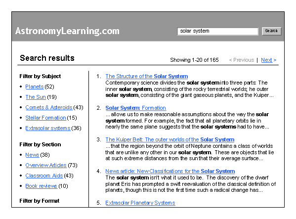
- Allow users to filter the search results by categories, so they can reduce the number of results while making them more topical.
- Include a numeric count of the total number of results returned for the query and the total number for each category.
- Use “and” as the default operator rather than “or,” so the number of results narrows instead of growing as the user adds more terms.
- Don’t confound this behavior by truncating the total results set at a round number like 100 or 500; this makes it difficult for users like Andrea to gauge the quality of her query.

Fig. 1: Filtering mechanisms help users narrow down searches that brought back too many results.
3. Surveying quickly
Some users scan through the results quickly, and if none of the titles strike them as an ideal match, they may proceed several pages deep into the results set. I’ve seen these users go to the fifth or sixth page of results without hesitation, then go back to the initial results to look more carefully or submit another query.
For instance, Dmitry could do this to hedge his strategy if his task isn’t fully defined. Hopeful that something will just pop out at him, he may do a quick scan of the first few pages, then fall back to another strategy if that doesn’t work out.
Design recommendations:
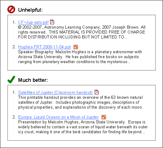
- Ensure that result titles are comprehensible at a glance, including application files like PDFs and Word documents, which often return cryptic file names by default.
- Highlight the terms that match the words originally submitted to help people scan the titles and descriptions more easily.
- Allow users to change the number of results shown per page to avoid navigating through too many paginated results.
These changes will allow Dmitry to evaluate pages more efficiently and successfully.

Fig. 2: Search engines often return cryptic file names for application files like PDFs and PowerPoint slideshows.
4. Making immediate judgments
Other users look only at the first few results before deciding whether the query was successful or not. Finding nothing, these users may then resubmit the query or give up on search altogether.
Andrea, the analytical thinker, would be discriminating about a result’s relevance to a narrowly defined informational goal. Confident in her expertise, she would also be quick to conclude that search is flawed if it cannot return a good match in the first few listings. This behavior requires that the best match be returned as close to the top of the list as possible.
Design recommendations:
- Optimize results for the most commonly submitted queries. Working from the search logs, try out each of the top queries and evaluate the quality of the top results returned, then optimize the content of those pages to improve their ranking.
- When pages cannot be further optimized, include a manually generated “Best Bets” sidebar to force those matches to appear at the top. This gives the page a second chance to hit the specific target in Andrea’s mind.
5. Agonizing over the query
Sometimes users have difficulty translating the concept they want to find into a specific search phrase. They will often rewrite the query several times before submitting it, and then focus on revising it further if the results are not as they had expected them to be.
Less experienced users like Kazue are more likely to show this behavior, especially if the task isn’t well defined and lies conceptually outside of her domain. Kazue may also be inclined to phrase the query generally enough to satisfy her global cognitive style, but fret over how general is too general.
Design recommendations:
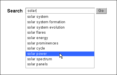
- Consider providing tools that assist in formulating the query, such as suggestion functions that present searches similar to the one the user is typing.
- Consider including lists of popular searches or automated storage of the user’s previous queries, saved to a profile or cookie.
Anytime that Kazue can select a query from a list rather than originating it from scratch, she will be able to search much more efficiently.

Fig. 3: Suggest functions assist users with formulating queries when they don’t quite know how to phrase their request.
6. Pogosticking
Some users click several results in rapid succession, quickly sampling each before settling on a best candidate to meet their needs. Jared Spool has described this as “pogosticking”—bouncing up and down between choices of uncertain relative value. This is the kind of behavior that Dmitry might resort to if the quick surveying behavior described for him above didn’t yield anything. Assuming that his temperament is fairly tolerant and he isn’t pressed for time, Dmitry may decide that he cannot determine the usefulness of pages without looking at them. These users need support for three primary tasks: assessing result listings, comparing result pages, and tracking work.
Design recommendations:
- Again, provide comprehensible titles and descriptions on the results page, as well as highlighted search terms.
- Pages can be even more effectively compared if highlighting can be extended to the display of the results page itself (as is possible with Yahoo! and Google toolbars).
- Allow users the option to open results in a new browser window to assist comparison. Sites like Ask and Easy Search Live are experimenting with page previews.
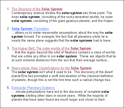
- Be sure to include a visited link color on the results page. This is absolutely essential for Dmitry to keep track of the pages he has already tried and rejected as he jumps to each of the matches from the hub listing page.

Fig. 4: Visited link colors help the user avoid revisiting results that have already been tried and rejected.
Conclusion
Search behavior varies with domain expertise and technical knowledge, cognitive style, goal, and mode of seeking. All of these factors will interact in complex ways to influence a user’s actions. Even then, behaviors will vary depending upon whether at that moment the user is under pressure, in a good mood, or any number of other idiosyncrasies.
The point is that the designer cannot select the behavior that a user will follow when conducting a search. This may invite the impression that the design must be overly broad, providing any conceivable function regardless of the likelihood it will be used, because we cannot predict whether it will be needed. Fortunately, users’ actual behaviors do fall into generally describable patterns, each of which has dependencies upon specific affordances of the interface. This is how designers can better cater to what appears to be chaos: make available those capabilities that best support the range of known behavior patterns for your target personas.
References
(1) James Kalbach provides an overview of literature around this topic in his article “Designing for Information Foragers: A Behavioral Model for Information Seeking on the World Wide Web.”
(2) For more on expert search behavior, see these two articles: Christoph Hšlscher & Gerhard Strube (2000): “Web Search Behavior of Internet Experts and Newbies”; and, Suresh K. Bhavanani (2002): “Domain-Specific Search Strategies for the Effective Retrieval of Healthcare and Shopping Information,” CHI 2002, pp. 610-611.
(3) See Ryen W. White & Steven M. Drucker (2007): “Investigating Behavioral Variability in Web Search,” International World Wide Web Conference 2007, pp. 21-30.
(4) See Donna Maurer (2006): “Four Modes of Seeking Information and How to Design for Them.”
(5) David Fiorito and Richard Dalton further described different types of navigation in their presentation at the 2004 IA Summit, “Creating a Consistent Enterprise Web Navigation Solution”.

Great explanation of user expectations and behaviors.
Here is my stab at categorizing the design patterns for finding and displaying the data results:
http://theresaneil.wordpress.com/2008/01/29/seek-or-show-two-design-paradigms-for-lots-of-data/
Very well put together John. Thanks for the article.
I’ll be forwarding this article to a couple of project members that are re-examining site search and looking for some best practices. Couldn’t have been more timely.
Great piece.
I find that a search of a firm’s intranet is just one place to find information. Information tends to be balkanized in different systems with different ways of searching within them.
I came to the conclusion that there are four types of searching for documents: fetch, recall, research and precedent. You can read more here: http://kmspace.blogspot.com/2007/04/four-types-of-document-searches.html
I find that these four types seem to be prevalent across the intranet and other internal systems. I think these four equate to your “mode of seeking” section.
The other interesting item I see is that most people want to browse to all information with an intranet. This may be because most intranet searches do not work very well. Much like the unhelpful example in Figure 2.
…And the unhelpful example 2 may get worse before it gets better. With database-driven learning management systems and knowledge managements systems that allow almost anyone to contribute material, lack of convention is harmful. But whose job is it to establish standards for posting and contributions? These folks might be the ones to offer naming conventions and protocols. Does a law firm assign a steward differently than a corporation with training department? Does the communications team handle this? Or is it up to the IAs and UX designers to moderate such practices? When does the development of a “naming taxonomy” begin to be valued as a strategy rather than a piecemeal approach or a to-do on a project task list?
The suggestions above are keen and effective…if one has the authority to implement them.
Excellent article.
One of my favorite search tactics is what I call “browse bypass.”
If I want to browse, but don’t want to spend time weaving through a sites heirarchy, I’ll search for an item that I know to be within the category that I am searching. Once at the detail page, I’ll latch onto a breadcrumb or some other heirarchical reference to the immediate parent category. Then I’ll back out to the category level and proceed to browse.
I think that I found this to be particularly helpful when Amazon was in full tab/sprawl mode. I could get so twisted around on their category labelling that it just seemed easier.
Of course, I’m hoping that the site I’m searching on with provide me with a breadcrumb or other mechanism to latch onto to orient myself once I’m there.
I just got hold of this article… really well arranged. The user dynamics prediction is something to me is highly subjective. and its a good attempt to learn their behaviour. but how would you actually categorize the parameters which can line up and inturn have a good objective clustering done for any user visiting any website. if you could throw some light on those aspects then its the best thing that person like me would be using :)…
Thanks John