Over two years ago, Boxes and Arrows’ then editor-in-chief, Erin Malone, and I decided it was time for a redesign of the magazine. The site had been tweaked and tortured into a shadow of itself over its first two years, the staff struggled with the hacked-up Movable Type installation (the software the site ran on), and it seemed about time for a makeover. Design magazines should be updated often. It’s in their nature.
That was over two years ago. And you, gentle reader, are still asking “Are we there yet?”
Finally, barraged by emails asking about the mystery surrounding the contest, the strange under-explained changes, the increasing degradation of Gabe Zentall’s elegantly understated design, we’re coming clean. We’re sharing the redesign and development process—in all its messy glory—with you.
Yes, folks, we are opening the kimono… just don’t expect Cindy Crawford underneath.
Where is the new design?
Back when we decided B&A needed an overhaul, we held a contest for a new design of Boxes and Arrows. Boy, was that a mistake.
Quality wasn’t the problem. Although the designs were terrific—beautiful, clear, and innovative—not one was what we needed. A successful design is more than beautiful; it is appropriate. And for a design to be successful, the designers need to work hand-in-hand with the client so they understand the client’s vision, and so the client understands the choices made by the designer. Collaborative iteration is the secret to getting to the right design solution. It’s embarrassing that we tripped up this way, knowing how many articles this site hosts on good process. We should have realized a contest was the very opposite of good collaboration.
Compounding our mistake, we chose to have judges—judges who weren’t us—because we thought that seemed right. A contest needs judges, right? Let the experts decide! Well, the fact is: Boxes and Arrows is our site, and the judges had differing ideas of what a great design for B&A was. They even had differing ideas of what kind of magazine B&A is—a usability blog? An information architecture site? They choose designs as winners based on their vast experience in IA, usability, design. But they all had different experience, none of it in being a B&A staff member, and they all choose different winners. The most usable, the most beautiful, the most… you get the picture. When Erin and I saw the judge’s favorites, we knew we were in trouble. Not only did they differ in preference, they could not envision the direction we planned the magazine would go. The judges just weren’t psychic!
Erin and I struggled through the contest process, realizing the issues but committed to following through. Too many people had worked too hard on wonderful designs to toss it all away. We tried to reframe the problem with additional instructions to our judges, and further-defined specs, but it was clear we were in too deep for an easy out. So we held fast to our core goals and prayed the winner might understand.
Luckily, the winning team, April 3rd, had a similar attitude about process. When they won, they immediately asked “Can we redo the design?” They wanted very much to work with us, iterating and exploring, to come up with the right design for B&A. Somehow they’d kept in mind what we had forgotten.
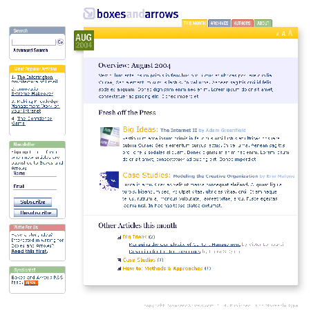
Figures 1: Contest winner by April 3rd (Click to enlarge)
Those who don’t learn from history…
We also should have known better because we’d been down this path before. When we were working with Gabe on the first B&A design, it took a while to find the right style. He went through multiple color and font explorations before even beginning page design, and founding team’s struggle with the design led us to write a mission statement so we could share a single vision. Design is often the place where ideas become flesh, and that is where you discover conflicts in the constituency. We were no different.
Even after we thought our design was perfect and launched with it, we discovered many things needed to be changed to accommodate our audience and staff needs. Today it’s the font size-too small! The next it’s the color-too light! The next it’s the images-we don’t have a Welcome this week! We need a new icon! And soon the design only loosely resembled the original.
Even Gabe was annoyed with his design when he saw it in HTML. Daily, I received polite little fix-it notes. “The gray is #eeeeee, not #cccccc.” “Please make the type 10px, not .8em.” Eventually, he forced himself to stop looking at it and no more sad emails appeared in my inbox.
 |
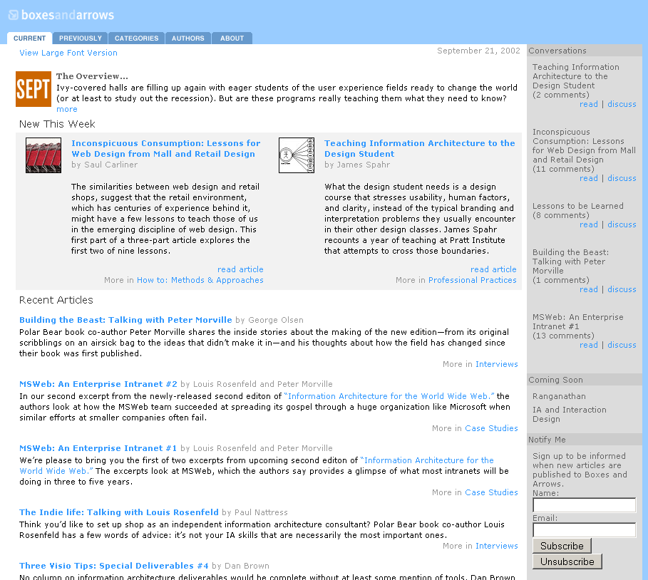 |
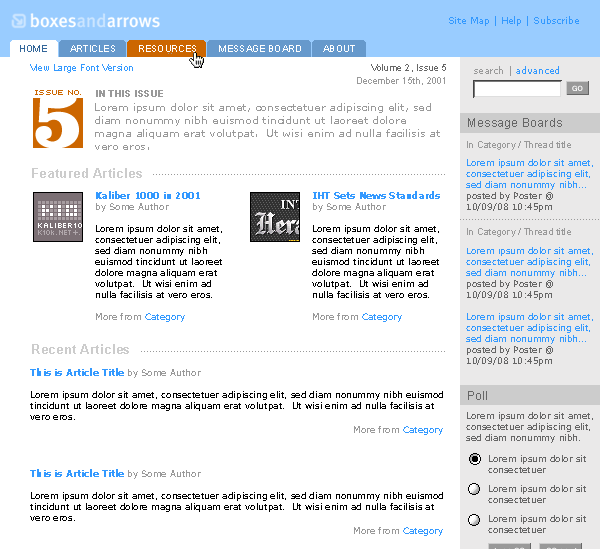
Figures 2: Original sketch by Gabe Zentall and the design in September 2002 (Click to enlarge)
B&A finally settled into a stable form, and lived more or less happily housing smarter and smarter articles by the design community. Until we decided to muck…
Our story continues
So finally we had a light at the end of the tunnel for the redesign. The design team had been selected, was ready to go and was eager to design something amazing. We had done our homework and we knew what we wanted from a new design! Ready, set…
And then several things happened at once. I decided to build a new CMS from scratch, and Erin decided it was time to pass the baton on to a new editor-in-chief.
Rolling your own
Movable Type, despite the glowing blog entries and great success as a self-publishing tool, was not made for and is not a suitable tool for a team of writers and editors using an editorial workflow to produce quality articles. It’s a blogging tool. Knowing that we wanted a more-robust CMS, we looked at a number of open source solutions, including Drupal, WordPress, and Mambo. But after hacking Movable Type, we were wary of using the wrong tool for the job. That took WordPress out of the equation. And both Drupal and Mambo are like Swiss Army knives: they do everything, but not one thing well. Ever open a bottle of wine with a Swiss Army knife? Using an open source CMS is about as pleasant.
The fact that there were no tools for small groups to publish collaboratively seemed strange, and an opportunity. I suspected fate’s hand when, while giving a talk in Copenhagen, I was introduced to Lars Pind, a programmer who had built several CMS’s. He and I chatted, and he expressed the belief that it was time for a revolution in publishing tools. Around that time, both A List Apart and Digital Web were building their own CMS’s to run their magazines. I cried out “The writing is on the wall! Citizen journalism! New paradigm! Let’s make software!” With that, Lars and I started a new company, Cucina Media, and began our first product, PublicSquare.
So how does this fit with the redesign?
PublicSquare was originally designed to allow for lightweight customization. We thought if we wrote nice, semantic HTML all it would take to customize would be stylesheets, Zen-garden style. Again, we were mistaken. It soon became clear that people care even more about customization with their publications than with their blogs. A stylesheet can take you only so far, despite many articles to the contrary. It’s really not possible to completely separate form and presentation, as April 3rd learned to their chagrin. They struggled mightily to get the new B&A design launched for the 2006 IA Summit, giving up sleep only to see the launch fade in the 11th hour, thwarted by what CSS can and cannot do. With that failure, we decided to regroup.
Luckily, Lars tripped over an interesting templating language, Liquid, made by the folks over at Shopify. Liquid gives all PublicSquare users the ability to fully customize the design-including our much-put-upon B&A design partner, April 3rd. Now that we’ve got the templating language in place, we’re working to stabilize the markup so that April 3rd can do their job without having to redo it over and over again. Nobody wants to see the IA Summit fiasco happen again, even if the only ones who knew about it were Lars, April 3rd and I.
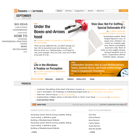
Figures 3: More recent iteration on contest winner by April3rd (Click to enlarge)
Now what? The redesign and beyond
With Erin’s move out of day-to-day oversight, Boxes and Arrows’ internal processes really had to start changing. We brought on new staff, including our first managing editor Javier Velasco, who watches over deadlines and quality; and Liz Danzico, the new editor-in-chief, who helps shape strategy. With new people, we’ve gotten a few new projects underway:
* Publishing: We started a series of new projects, including our first publishing venture. We’ve been talking about paper publishing since the beginning, but it’s just been this year that we’ve started planning in earnest. We’re stepping out with a collection of essays on tags and tagging.
* Events calendar: The Events Calendar, which you may have noticed, is another new addition that came about from personal experience. As a former design manager, I always had a hard time finding events for my direct reports to attend. My staff often came to me trying to choose a conference, but I never really knew about every event that was out there. I saw another opportunity: why not create a centralized dedicated list of events for design practitioners? I see you folks agree; we’ve been bombarded with events!
* Suggestions: You may have noticed the Suggestions area. This is the place for you to add your own story ideas and vote on what you think we should be doing. Beyond that, people have been using it to ask questions, note interesting articles, and make suggestions about site functionality. Don’t think we’re ignoring that! It’s clear more features such as a forum are required. B&A is a place for many voices, and we want to work toward making a tool that makes publishing more participatory while maintaining the quality that an editorial process and staff provides. We’re also learning a lot about voting, reputation systems, and user profiles (i.e., what makes a community tick).
Being without-profit
Until now, B&A has been a “without-profit” venture—just me, paying the hosting and keeping volunteers motivated with the help of an amazing volunteer editorial staff. B&A is still going strong, but we want to take it to the next level, which requires money. We could pursue sponsorships and go non-profit, but we’ve decided to try to make B&A into a self-sustaining business. People, no matter how committed to design and the community, eventually want their weekends and evenings back, and get sick of working with no return beyond the gratitude of the community. The goal is to be able to pay editors and writers, as well as fund new ventures needed by the design community.
This does mean some changes in the site you’ve grown so fond of, including the addition of ads. Don’t fret! We plan to stick with only relevant ads and relevant features. Although Budweiser won’t be advertising here anytime soon, do expect things like a job board or a bookstore.
We care about “Y”
We’re working toward a special way to launch the new design. We’ve asked a guest editor to curate a special issue on virtual and physical spaces, and we hope that will be the first in many special issues to come. Sure, we all love wireframes, but man cannot live on Visio alone!
We’re also interested in hearing more about the directions in which you’d like to see the magazine go. Too often, people dismiss the chance to help a publication grow—”They are all about X, they don’t care about Y.” Well, we do care about Y, we care about it very much. Boxes and Arrows was originally created to fill the need of senior practitioners to get better articles on the questions they faced in their work. As those practitioners have grown, we needed to grow also. Watch for more articles like Erin’s on creating a five-year plan, more articles like Icon Analysis, and, in general, more exploration of the issues you are just becoming aware of (…We hope! You are hard to keep ahead of!).
So, that’s our story so far. The good, the bad, and the ugly. We decided to let you know, even though it’s not a pretty story. We have made missteps, gone out in strange directions, realized we were drinking strange brew, and then tried our best to get back to a better course. In our daily lives we often make mistakes and then spend our time covering them up, trying to look cool. So this article is all about admitting we’ve done dumb stuff and owning up to those mistakes in the hope that you won’t emulate us, but will keep us honest and relevant.
Boxes and Arrows is our magazine. The line between staff and reader grows thinner and thinner. We welcome you to help us as we grow, with your honesty, your critiques, and your participation!
Excelsior!
While it sounds like it’s been a long complicated process to get where you are now, you have definitely taken the right approach to make the CMS and design changes independently. So many sites try to make those two changes at the same time which is even more of a nightmare!
I’m also glad to hear your bit about focusing on the “Y” – I’m looking forward to watching as the magazine grows and matures.
I love the most recent iteration. It looks great! I especially like the weighted category navigation.
And the way Professional Practice breaks the grid is a nice touch.
Love the story. Thanks for sharing the good with the bad. Most companies only try to make themselves look great, so worried about their image. Honesty is a forgotten value and people forget how much people appreciate honesty. Love the new look so far.
I wholehearted agree with Tom. Thanks for an insightful and honest article!
Great, honest look at an often typical redesign project. Funny, though, I’ve never considered a redesign a minor project! Not sure it’s entirely applicable, but remember the overquoted Thomas Edison:
“I have not failed 700 times. I have not failed once. I have succeeded in proving that those 700 ways will not work. When I have eliminated the ways that will not work, I will find the way that will work.”
(Just hope your budget or sanity do not run out before the end.)
That’s the way I’ve viewed the evolution of human factors and usability since the Web took off in the 90’s. We as practitioners have had the opportunity to learn from our experiences and share them with each other. As a result, consider how far we’ve all come. Do you remember the proliferation of truly horrendous designs during the Wild West Web Days in the mid to late 90’s?
It takes a a lot of courage to bare your mistakes, particularly when admission live on forever in a blog post somewhere. Your candor is commendable – we can all learn from this, and use your experience as a resource for some of our own clients who might otherwise hold out for what they think is a cheap-and-easy solution. Here’s to being human!
Good story. Can’t wait to see the new design in action.
A little feedback on publicsquare: The urls it makes could use work. maybe the slug should be editable? also, google and some other search engines don’t recognize underscores as word breaks, so that can harm findability. (Hyphens do work.)
I think I said it when design competition results came out but I’ll say it again:
If it works, don’t fix it.
The first design of B&A was appropriate and pleasing. And it was working. So please, just publish more of the good stories we are used to find here and don’t bother with the visuals.
Seeing that the mission statement helped so much to get through the bumpy re-design road, and that that there are clear plans for the future (wanting to make it self-sustaining), are you taking it to the next level and writing a business plan?
On that note, what kind of immediate help is needed? I’ve been reading B&A from day one and have wanted to collaborate, but I know writing and helping editorial is not how I’ll do that. What else do you need? Or better, what do you need the most?
Christina,
Great info, thanks. I’ve been enjoying B&A for years now. Just wanted to share a few thoughts.
Instead of “We welcome you to help us as we grown, …” did you really mean “groan?” (I know, you meant “grow.”)
A key theme to me centers around your statement: “Collaborative iteration is the secret…” I’ll continue the Edison line of thought, but with a slightly different slant. I’m also a fan of an IXDA-er’s signature quote… “Design is a process – an intimate collaboration between engineers, designers, and clients.” – Dreyfuss, Industrial Designer. Somehow we cling to this notion that there is a holy grail process. Only if you consider 7 rounds of trial and correction a “process” is there a process for something as intricate as today’s software design challenge. I recently heard someone say in a Philly presentation “All processes are essentially broken.” To me the limiting factor isn’t adherence to some sort of procedural map so much as a pre-arranged willingness to make changes until we get it right.
If you want a good open-source for collaborative publications, have a look at SPIP (www.spip.net). It is very flexible, very practical, and, well, it’s just good. Worth your time, I assure you.
I’m sorry, but any site with that confusing of a website has got to be too hard to use.
I think the problem is we are looking for “the ultimate CMS” when we should be looking (and building) the right-fitting CMS. I’m sure some folks will use PS for things it wasn’t built for once we’re live, but I hope that people who are seeking a tool between a monster CMS and a teensy blogging tool will find us, and find that like goldilocks, this one is “just right.”
Yes, it’s too easy to slide into shortcuts.. PS could be my husband, philippe sarrazin! or post script of course.
I think the answer is stopping building for everybody. You are dead right when you say one man’s bloat is antoher’s killer feature. We are building for small to medium publishers. We hope that will help us get it right. We hope. But punditing is way easier than building.
Even the greatest, well thought out intentions will be plagued with process issues, and understanding who the reader is will always be a defining catalyst for structure.
Thanks for the informatitive article; it’s great to know we’re not all really alone. 🙂
PublicSquare is now launched. If you want to build a magazine like Boxesandarrows.com, then go to http://www.publicsquarehq.com
Oh, I forgot– WOOHOO!!!!
Good and Impressive Blog.
http://acaithermo.net/?p=167