It is said that a tenth century Grand Vizier of Persia took his library of 117,000 volumes with him whenever he toured his kingdom. He trained his caravan of camels to walk in alphabetical order so that he could always find what he wanted. Luckily, these days it is somewhat easier to organize and present your content in alphabetical order.
A-Z indexes are sometimes seen as the less desirable counterpart to other navigational elements such as sitemaps and, especially, search. However, A-Z indexes can be a valuable secondary navigation tool, especially for large sites with a lot of granular content.
Because there are already a number of excellent articles online that talk about the value of A-Zs, I’d like to outline instead what we did at bbc.co.uk in the first half of 2005: namely, repositioning the site index as a viable secondary navigation tool. I’ll also offer a checklist of eight areas to consider when thinking about creating an A-Z site index. The list has already proved useful in advising BBC colleagues with no background in indexing or information architecture on how to painlessly create local A-Zs for their particular areas of content.
Project background
The project to overhaul the bbc.co.uk index began in late 2004. There was a push to change the visual design to make the user experience more aesthetically pleasing, and a need to address known usability issues with the existing A-Z index, including a lack of understanding of the multi-page format and lack of awareness of the special page for numeric entries. Unlike many web design challenges, the goal of the pages was to send the user off somewhere else as quickly as possible rather than keep them on the page.
We also needed to tackle the hybridized nature of the index, which was part alphabetic listing, part directory, and did not serve either of those models well. Research had shown that users had confused expectations about and varied success in using the index.
The huge size of bbc.co.uk precluded providing a granular index that could support comprehensively categorized headings. However, a more achievable goal was to enable most pages on the sprawling site to be reached within three clicks of a link in the index. One of the other key goals for the project was to create and communicate editorial guidelines to the rest of BBC New Media. For the first time, we defined a definite level of granularity beyond which content would not be considered for inclusion. Our site has over two million pages; for this reason, we decided not to consider single pages of content for inclusion in the index. This was an easy guideline for stakeholders and content authors to grasp.
“More supermarket, less junk shop:” Defining design objectives
There is more to index development than sorting out words and phrases on a page. The success of the BBC project also hinged on using proven user-centered design techniques. This included developing personas, using a creative brief, and working with a visual designer. The ultimate aim was to create an attractive yet functional page.
Personas
The project team developed two personas for the project. The secondary persona was someone who would never use the A-Z, except as a last resort: Stephen, who is 22 years old, from London, and who most definitely has a search mentality. The priority, however, was our primary persona (based loosely on a real participant from the first round of testing), who would help the team imagine how a real person would use what we were building. We named her Sheila.
Sheila is 59, retired, and lives in Newcastle. Her web experience is mainly limited to genealogy and browsing kids’ content on bbc.co.uk with her grandchildren. She has used email and has bought online, but without great confidence. She doesn’t really like searching, and prefers to scan a list of links even if it means scrolling.
Design concepts
A creative brief document cemented the business objectives and ensured that the tone, look and feel, and personality of the index would meet branding needs. As simple as the pages are, with extensive use of white space to aid scannability and legibility, they also look friendlier just from having a little color. The blue also means the A-Z is in sync with the wider bbc.co.uk brand color, as chiefly seen on the homepage.
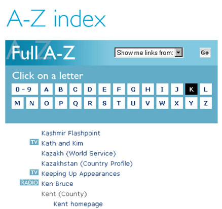
Top of a page of the A-Z index, showing the use of blue to match the bbc.co.uk brand color
When thinking about personality, we realized that there was nothing different about the A-Z as compared to any other navigation tools on the site. Everything should be “warmly informative” or “approachably organized,” wherever you’re browsing. Specifically, we keenly felt the need to make the A-Z more like a supermarket (comprehensive and well-organized) and less like a junk shop (random and gems buried amidst the clutter). Not all junk shops are like that, of course, but it was hard to see the bbc.co.uk A-Z as one of the good ones before the project!
Two further enhancements are worth mentioning. Statistical analysis had shown that many users of the previous version of the index never visited any page other than “A,” because that was the first one they would come to on clicking the A-Z link from somewhere else on the site. We decided to develop a new front page that had no alphabetic entries (other than Popular Links) but had links to each letter page instead.
Secondly, we introduced new “filters” for certain link types, such as those to web pages about BBC shows, some of which also have video or audio content. These pages are in addition to the 27 main letter and number pages, which show only TV or radio program page links. The special filtered pages are intended to aid browsing for A-Z users coming to the index from virtually anywhere on the site, and also to be the first destination from broadcast-specific areas of the site (most notably, from www.bbc.co.uk/tv).
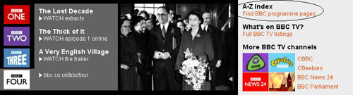
Part of the bbc.co.uk/tv portal page, with ringed link to TV program-only part of the A-Z index
Competitor analysis
The team looked at around 20 other indexes from both elsewhere on bbc.co.uk and on the wider web. As well as recording subjective impressions of how well these indexes worked, we compared the indexes against a set of criteria such as intra-letter navigation, link readability, use of icons, use of color and/or whitespace, quality of link labeling, relevancy of content, and availability of other navigation tools (e.g., sitemaps).
From the set of bbc.co.uk indexes surveyed, BBC Health’s A-Z of illnesses and conditions stood out, particularly for offering different approaches to browsing and for clean, attractive design. Of the non-BBC indexes, the American Association for Artificial Intelligence’s index was strong on cross-referencing (“See” and “See Also” references). It was also very usable due to its mix of scientific and non-scientific terminology to help support the site’s goal of making complex ideas accessible to a general audience.
From this design and research work I realized that some of the nuances of compiling an A-Z could be distilled into a short checklist for non-specialists and specialists alike. The list is illustrated with examples from throughout the bbc.co.uk A-Z index. I hope that the areas covered below are general enough to deal with scenarios from all kinds of knowledge domains.
Eight-point checklist for creating terrific A-Z indexes
1. Know your audience
It’s vital to understand the way that your audience interacts with your website and your index. There are many ways of doing this; three that can be particularly useful are search log analysis, persona development, and user testing.
Search logs have been invaluable throughout the lifecycle of the A-Z to highlight the areas of interest to users. They also shed light on the language used by people trying to find things on the site. Even though the A-Z is a browse tool and search is a search tool, don’t ignore the common goals of their respective users: finding stuff easily.
As outlined earlier in the article, creating personas helped guide the development of both visual design and information design for the project. They’re a fun, powerful design technique that helps provide a framework for a successful project.
More tangibly, do user testing on new designs or newly created indexes, ideally at interim stages and not just at the end of the project. There were two rounds of user testing in the BBC project, one with participants recruited by an external agency, and the second with BBC staff who weren’t involved in the project and weren’t in the wider user experience design team.
2. Show your numbers
Don’t make your users guess: even if there’s only one non-alphabetic entry, show that it exists. Many indexes fudge the challenge of entries that begin with numerals by shoving them, for example, in under ”A” or “Z.” Chances are, the entries will only ever be found by serendipitous browsing or lucky guessing.
We used the label “0-9” because there were no entries beginning with a punctuation character. It’s not ideal because, as one participant in testing suggested, users wondered where all the numbers (1, 2, 3, etc.) would be. That said, nobody else questioned the label, so it seemed a good solution. I’ve also seen the hash symbol (“#”) used to encompass both numeric and punctuation character entries, as well as “num” for numeric-only entries.
Whatever it is labeled, make the numbers section or page prominent by placing it in front of the letter “A.” This is a convention in computer books that index technical concepts. In the row of letter blocks that appears at the top of every bbc.co.uk A-Z index page, “0-9” resembles the double door for Christmas Day on an advent calendar. This may seem to give it undue prominence, but doing so gives the page a better chance of being spotted and used, illustrated in image 3:
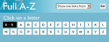
Top of an A-Z index page, showing double size box for the numbers page
The site indexes of technology companies can be good sources of inspiration in dealing with non-standard entries; a good example is http://java.sun.com/a-z/.
3. Acknowledge articles
The question of how to deal with entries that start with “the,” “a,” or “an” became important for bbc.co.uk because of the sheer volume of program titles that needed to be added to the index. Eventually we decided to double-post entries under both the first letter of the article word and whatever letter the next word started with, hence entries for both “The Apprentice” and “Apprentice, The”.
As with the previous tip, why make users stop to think about how the indexer might choose to see the content? The beauty of an A-Z over a directory or a sitemap is that different mental models can be supported and the same thing can appear in more than one place. This gives it an advantage over, say, the Grand Vizier’s camels.
4. Include synonyms
Synonyms, in the form of “See: XX” references, appear throughout the bbc.co.uk index. As in the traditional thesaurus, they are used to show equivalence between a word or phrase and its preferred term. Synonyms in an A-Z add richness to the list of entries–and can often allow you to speak your users’ language without losing the ability to call entries by their correct names. Equally, synonyms play a role in educating users as to what those correct names are.
For bbc.co.uk, many synonyms are used in the A-Z to provide alternative access paths to branded content. For example, the radio station Five Live is always written with a word rather than a number, but a user scrolling through the numbers page will see the pointer:
5 Live:<br /> See: Five Live homepageSynonyms are often abbreviations or acronyms of phrases, as in this entry for the well-known cricket commentary program:
TMS:<br /> See: Test Match SpecialSynonyms can also help users who think in terms of categories or subject areas (rather than those looking for a known item). They may not know exactly what content they want, but can be directed to something appropriate by considerate use of “See:” references. For instance:
Family History<br /> See: Who Do You Think You Are?5. Properly index proper names
People should be indexed by surname rather than first name, as per book indexing convention. There are of course some exceptions; for example, the names of monarchs (“Charles I”), certain celebrities (“Mel B”), or people from cultures where the surname appears before the first name (“Mao Tse-Tung”).
(The bbc.co.uk A-Z does not contain any entries for people’s names, unless they are part of a site name or program brand. Thus, there are entries for “The Jeremy Vine Show” under both “T” and “J,” but not “V.”)
Much more detailed information about name indexing can be found at Martin Tulic’s site.
6. Consider your cross-references
In general, the bbc.co.uk A-Z avoids excessive cross-referencing, which could make already long pages less usable and less attractive to casual browsers. However, bringing closely-related concepts together can add value to the index and promote content in different places. Cross-references are shown as “See Also:” pointers in entries, as in this example from bbc.co.uk, where a country name is linked to content about the languages that are spoken there:
Sri Lanka
Sri Lanka (Country Profile)
Sri Lanka (Cricket)
See Also: Sinhala (World Service)
See Also: Tamil (World Service)
7. Use qualifiers and extra information
Besides synonyms and cross-references, there are other ways to make your index more user-friendly. Qualifiers are extra bits of information in parentheses, attached to index entries, often for clarifying concepts. For example, the bbc.co.uk A-Z qualifies dance as “(Performing Art)” in order to differentiate it from dance music, which is also covered in depth on the site.
Qualifiers can also be used on large sites where a subject is covered in more than one place, a particular issue for bbc.co.uk. The entry for “Comedy” is:
Comedy<br /> Comedy homepage<br /> Comedy (BBC 7)<br /> Comedy (BBC Two)<br /> Comedy (BBC Film Network)<br /> Comedy (Radio 4)It is also possible to supply extra information in the form of what would be called scope notes in a thesaurus. These could be useful in a website index where an entry for a new or growing brand, or an unusual concept, might benefit from further detail. For example:
BBCi – Information about interactive TV8. Take pride in the index
Dealing with everything mentioned in the other seven tips will give your index a fighting chance of being successful. None of it will matter, however, if users cannot find it.
Make the A-Z index available from all parts of your site if you can, preferably linking to it in a consistent, prominent place on every page. This might be in a toolbar or as part of the navigation. Whatever you do, don’t follow the example of some sites that put the link to the A-Z at the bottom of the page, in tiny size 1 font, with other links that very few people (apart from lawyers) ever see, let alone click on.
Take pride in your index, and be like the owners of this second-hand bookshop in London, who clearly wanted customers to know they cared about organizing their stock!
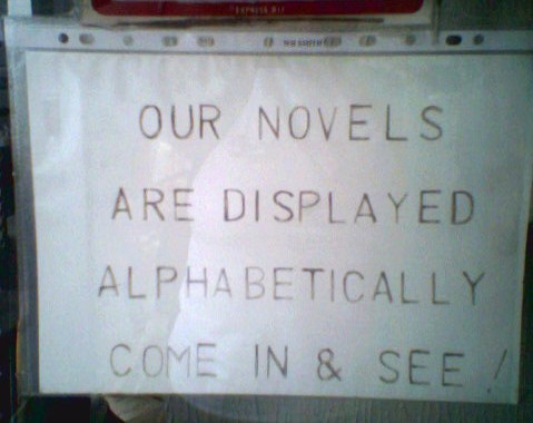
Sign from a London bookshop promoting beautifully organized stock
There is a wealth of information on the web about indexes of all sorts, not just A-Zs.
The following are good places to start:
A-Z Indexes to Enhance Site Searching
A-Z Website Indexes Explained
IA Wiki WebSiteIndexes
Beyond Book Indexing
There are many books, especially from the field of library science, that cover the concepts and practice of indexing. I have found the Art of Indexing, by Larry Bonura, a useful introduction.
Lastly, Indexers and Indexes in Fact & Fiction, edited by Hazel K. Bell, is a reminder that indexing isn’t just about dry, meticulous text analysis. The book contains dozens of idiosyncratic, political, useless, or just plainly wrong-headed indexes.
Great work, Helen. Thanks for this.
Wondering what the usage of the site index at the BBC is? Jared Spool has observed that few people turn to such indexes. See: http://www.uie.com/brainsparks/2005/12/16/what-about-site-maps-and-site-indexes/
I’m sure many readers need a pretty solid justification to be able to tackle such projects for their sites. Seems site indexes are perceived as having limited value. Maybe they do?
Very interesting article – and quite helpful related links at the bottom.
Nice article. Here’s another resource: The American Society of Indexers as a web indexing SIG. You can check out their website at http://www.web-indexing.org/.