Enterprises often have a simplistic understanding of navigational structures in UX Design. Companies shy away from messing with known organizational schemas for fear that their users or customers will become confused and run away. We don’t give our users enough credit.
As a result, most software navigational structures either reflect hierarchical departmental company/brand organization (because how can users be confused by that?), or a very top-heavy list of bucketed themes loosely based on general product “themes” (hello Amazon!).
Besides thinking about the actual organizational structure, we also know that a user must have some guideposts to retrace their steps if lost. Thus, today, “leaving a trail of breadcrumbs” really means allowing the user to get back to where they came from in a linear path by backtracking their steps. How cumbersome it is to hierarchically retrace steps or click the browser back button like a well trained monkey.
Taking all this into account, we got to thinking: What if a navigational structure could shapeshift to fit a user’s intention at any moment at any place? What if a user could apparate to any point of the website/product from their current location based on their intention/need? Isn’t that what hyperlinking is all about anyway?
To do this, a proposed navigational structure would have to (1) understand what the user intends to do at all times and (2) be flexible enough to transport the user to any place in the software based on the current user intention.
Let’s examine these two requirements separately.
1. Understanding what the user intends to do
Understanding user intentions requires fulfilling the pervasive user expectation that digital properties should behave in a more “human” way, where websites, products and services we design have an “organic conversation” with the user.
An organic conversation is a bridge of understanding between the customer and brand within the digital medium where they meet; a conversation that flows naturally just as between two friends.
This organic conversation can be created by designing intent-based navigation through a process we call Designing for Customer Intentions. To do this, we must understand, document, and design from the viewpoint of what customers intend to do when interacting with a digital medium, rather than cataloging and rearranging the content businesses currently have to be more “user-friendly.”
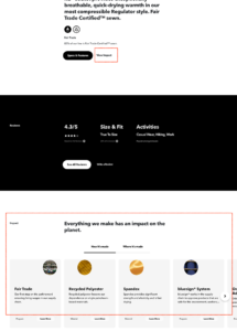
An example of this can be seen on Patagonia’s individual product pages. After all the expected product information, there are doorways into learning how and where the item is made. Given the well-documented eco-consciousness of Patagonia customers, it’s likely that one of their intentions is: when I purchase a product, I want to ensure/learn about how it’s made. Patagonia was started on the premises of, and intentionally appeals to, customers’ minimalist or sustainable ethos.
To satisfy their user’s intent to discover the impact of available goods for purchase, the navigational structure of the page includes an “Impact” section, detailing fair trade, materials, and other informational elements their customer may care about. This reinforces the customer’s perception that the business “understands” them. This, in turn, leads to increased customer feelings of autonomy and competence regarding their purchase, and therefore to higher purchase rates and increased loyalty.
2. Apparating the user
Imagine wandering around a well designed house. Rarely is there a need to go back to the front door to find the pantry or the bathroom, because there are well-designed ways to take you to the right room at the right time. Similarly, there is no reason to force the user to retrace their steps in a digital product to move forward.
If we think about navigation as an organic conversation between the digital property and the user, navigation takes on new meaning. It’s no longer just a well-organized hierarchy of content, but a lateral, intentions-based structure that shifts to accommodate user intentions in the moment.
You’ll see examples of this with text-heavy content sites like Wikipedia where you have contextual links to further research related content. Likewise, in the product space, you can observe this lateral, intention-based navigational structure in good CRMs (customer relationship management systems) that allow the user to access all needed functions without having to go back to the main dashboard.
Why Navigation Needs to Evolve
Creating an intentions-based navigation is required for our software navigational structures to evolve with our users’ expectations.
Users expect digital products to understand them as other humans do and we must innovate to fulfill, and eventually exceed, this expectation.
Let’s imagine, for a moment, that there are generally two types of personas that describe 70-80% of all users of a digital property or website: 1-people with a singular goal who know what they want; 2-explorers who meander and delight in discovery.
Our solution so far, has been to rely on breadcrumbs, but no more! Whether exploring or focused, users expect technology to “understand ” what they want – which really means people expect the business to magically guess their intentions, and help them apparate (or transport) to wherever they need to go to fulfill those intentions.
Designing intentions-based navigation structures helps the customer and the business. Businesses are better served when users dive deeper into their online ecosystems through continuously fulfilled intentions. Ever take 3 minutes to watch a YouTube video, only to come up 45 minutes later from the rabbit hole of those similar videos offered up on the right side? You have intentions-based navigation to thank.
Intentional navigational design serves the business because users enjoy autonomy and competence in using the site or service. They become loyal users, intrinsically motivated to return to this business again and again. Tracking user navigational patterns further allows the business to learn more about the user, which in turn allows them to provide better service.
Defining User Intentions Is Key
Designing for customer intentions decreases the amount of information that the customer needs to consume, decreases their cognitive load, increases their success rate of fulfilling their goals, and improves the overall positive perception of their experience with a business. Over time this creates happy, loyal customers.
We will explore how to design for user intentions in Part II, the key takeaway here is:
Serving up the right content at the right moment to meet, or exceed users’ goals and expectations, UX experts serve both the user and the business in a more thoughtful, profitable way.
UX designers create impactful spaces that sit comfortably at the intersection of business, technology, and design by creating flexible, adaptable navigational structures around well-defined user intentions. This helps the designer create and retain loyal customers. A win-win.

Evolve or Die
The Designing for Customer Intentions method is not the only way to evolve the design of digital product navigation. For example, there are plenty of articles written about “jobs to be done” and other methods. We encourage you to research these methods and develop your own viewpoint on how to evolve your practice. The main idea is to evolve, or risk losing your users to other, more intentional, competitors.
So, dear reader, how will you choose to humanize navigation to align with what users intend to do in your digital space? The choice is yours.
Featured photo Photo by Susan Q Yin on Unsplash.


What if there are divergent intentions? Why can’t a page have multiple navigation paths including breadcrumbs? Breadcrumbs can be quite useful when I arrive deep in the site (eg a product page) via search engines & want to browse alternatives (eg via product listing). Please don’t throw out the baby with the bathwater. The number of times I struggle with navigation because it has simply become unfashionable to provide reliable nav or UX designers try to be too clever & end up being like the annoying M$ Paper Clip! Until your AI can reliably read my mind don’t try to control where I can go by hiding navs that YOU think I wouldn’t want.
A page can (and should) have multiple navigation paths. We’re not suggesting removing navigation that is useful and purposeful. Instead, we’re asking IAs to include only that navigation that IS purposeful. The customer intentions method is meant to make our navigations more intentional and focused so that users don’t struggle. If you end up giving it a try please let us know!